Which Tool is Best?

One question we in eLIS are often asked is which tool is best for a particular assignment, or the obverse; what sort of assignment would a particular collaborative tool work best for? The answer, which I always imagine frustrates instructors looking for clear, unambiguous information to apply to their teaching practices is, “It depends.” We also make the point that it’s important to start from your learning objective and go from there. The tool should always be in service to what you’re trying to accomplish.

Once you have your objective defined, there are a number of considerations that can go into choosing which tool to use for, say, asking students to reflect on a reading, getting formative feedback to help determine what to emphasize in an upcoming unit, or encouraging your students to interact to inspire collaborative learning. Should you use the assignment tool or a journal? The discussion board or a blog? A wiki or VoiceThread? There may be instances where one or the other of these tools is the clear best choice, it’s true.

However, one of your main considerations should be what’s convenient and familiar to you and your students: what tool you know well enough that you can create an exercise that will bring the material or concepts you’re working with to life for learners. There’s no one tool that’s going to be the best in all instances, but if you have a go-to tool, you can almost always figure out a way to make it work for the task at hand.

In my parents’ home, the go-to tool for around-the-house, quick-fix situations was a butter knife. We used them to drive screws, scrape gunk off of pots and pans, pry up nails or push-pins, remove staples, open envelopes, scrape off excess putty or glue from quick repairs, spread butter on bread or baked potatoes, cream cheese on bagels, icing on cake, pull up burning toast out of the toaster, or in any number of other scenarios.

It may surprise you to learn that my dad was an auto body repairman, and there was always an extensive collection of tools out in the garage at our house, one of which could do almost any particular (non-food-related) job a little bit more efficiently. But a butter knife was handy, right there in the kitchen, and frankly, it did most of the jobs it was apt to be used for nearly as well as the thing you would have to go out to the garage on a cold night and rummage around to find.

Arguably the most versatile tool in Blackboard/MyLesley’s suite of tools is the discussion board. While there’s no justifiably convenient way to make it function as a private journal, for example, it does have capabilities well beyond its named purpose. It can be used as a makeshift blog or as a place to host visual student work, which is the way we most often see the wiki tool used. We’ve also seen it used as a place for students to post assignments.

The discussion board can be made gradable. Using the viewing setting “Participants must create a thread in order to view other threads in this forum,” it’s easy to make sure that students don’t see each other’s work before they submit their own. Once they do, they can automatically view the work of their peers. With the default settings of MyLesley forums, students are not able to edit their own work once it’s been submitted, although you can change that setting if you wish.

While the discussion board may be the most versatile tool in MyLesley — the true “butter knife” in your course site — it’s certainly true that virtually any of the tools available in your course site can be used in unexpected ways. It only requires your creativity and resourcefulness to find those new, unconventional repurposings.

How have you used MyLesley’s suite of tools in novel ways? We’d love to hear about it.

Lessons learned from running our first online Design for User Experience course

Today’s post is by Lisa Spitz, Lesley Assistant Professor and consultant for the College of Art and Design’s bachelor’s program in design for user experience.


In Fall 2, 2016 we ran our first course in the Design for User Experience program, Typography 1. 10 students signed up for the course. Excitement ensued. And then I started looking into the class roster. Of the 10 students, just 1 was a Design for UX student. The remaining students represented a mix of Business, Counseling, and Psychology programs. As a new program in an entirely new category for Lesley, I realize that it takes time to market and enroll new students. Nonetheless, I was a bit disappointed by the turn out. I didn’t question the applicability of the content to individuals “outside the field”. Principles of good typography is something anyone can benefit from. But I was worried about the complexity of the learning activities I’d planned and the Adobe software that was required to complete them.

What I learned over the subsequent 8 weeks is the importance of being flexible and the benefit of testing a course with individuals outside your domain. Let’s start with the latter point. For those familiar with Universal Design for Learning or Inclusive Design, it’s a bit like that. If you can make your course “work” for individuals outside your program, chances are it will work better for those inside your program as well. I’m not talking about “dumbing down” content or removing requirements. I’m talking about adding instructional supports to make the course content and expectations clearer. Here are a few ways I made that happen while the course was still in flight:

Providing better prompts
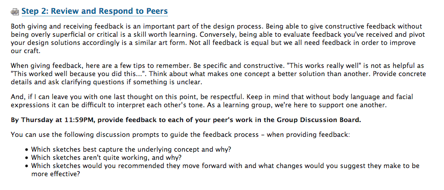
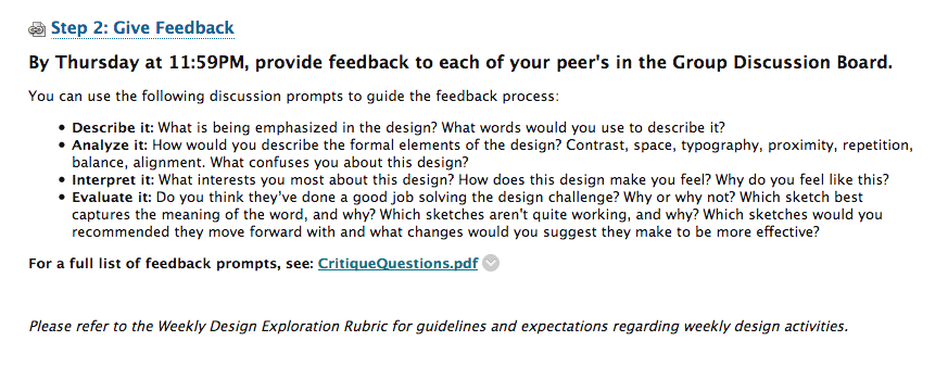
As a typography course, students were expected to create several designs and critique the work of their peers. However, journal entries revealed that students lacked the confidence to do so and some even felt hypocritical critiquing their peers’ work. The original critique questions I’d provided assumed they could judge which design was best (or worst) and give concrete recommendations on what to do next. But students were not sure how to assess the work of their peers. How would they know which was best? They certainly could tell which one they liked, but could not articulate why it was better. So, I went back to the drawing board and made the questions more personal. “What words would you use to describe this?”; “What is being emphasized?”; “What interests you about the design?” Etc. These questions were easier to answer. They required students to respond based on what they saw and how they felt, not what they deemed to be “good” or “bad”.

Original critique language:Critique_Before

Revised critique language: 
Critique_After


Creating more explicit directions

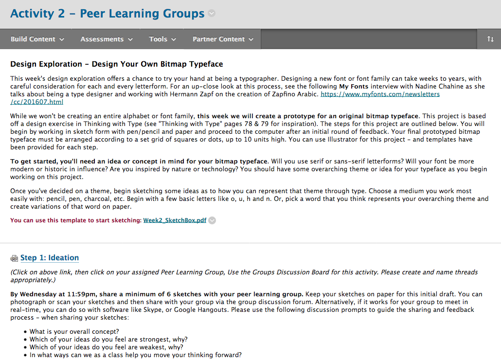
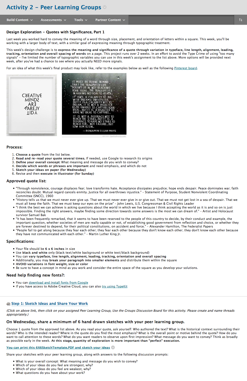
As a visual learner, one of the biggest challenges I faced when creating my own online course is finding ways around the “wall of text”. To explain an activity requires quite a bit of documentation. Aside from using all video or images, there’s almost no way around it. And when confusion arises, the tendency is to double down with more explanation. Instead, I took a step back, added images, cut text, and used more headings and bulleted lists – detailing process, specifications and steps for completion.

Original assignment description: (click for full size image)
direction_before_crop

Revised assignment description: (click for full size image)
directions_after_crop

Personalizing the feedback process
As students submitted their design work each week, I used the Assignment Tool to provide feedback. Originally, I defaulted to the WYSIWYG editor and took to writing what I thought worked/didn’t work and needed improvement. However, it felt as if some of my feedback was getting lost in translation. Again, the wall of text. Midway through the course I switched to video. Instead of writing a single piece of feedback, I recorded my screen as I looked at each of their design options and spoke about their use of typography in great details. If I’d have typed that feedback out, it would have been a novel. But to record it took just a few minutes. Students appreciated the new format and commented on how incredibly helpful it was.

All of these changes required a great deal of flexibility on my part. I ended up re-writing each week’s content before it went live; I added images to show, not tell; I created videos that demonstrated how to do the assignments; I offered up 30 minute 1:1 time slots to address individual challenges; and I gave feedback that was personal and specific. In the end, I had students comment on their appreciation for typography and design. But more importantly, I witnessed their transformation. When week 1 started, students proclaimed themselves unable to be creative. When week 8 finished, they professed the ways in which they were using their new knowledge of good typography to impact their professional and academic lives. As for myself, I still have some work to do within the course curriculum – but am confident that the results will be even better the next time around.

Check Out Atomic Learning!

Are you looking for help using Microsoft products such as Office 365, SharePoint, or OneDrive? Do you need help using Adobe Creative Suite? Are you interested in learning more about designing effective presentations or creating digital portfolios? Want to beef up your time management, critical thinking, or decision making skills? Check out Atomic Learning!

Atomic Learning is a free service available to all Lesley students, faculty and staff featuring hundreds of self-paced video tutorials on popular software tools, online tools, tech integration, mobile devices, college and career readiness, and more. Atomic Learning breaks down each topic into manageable tasks and explains each task through a one-to three-minute tutorial. You can view a tutorial when you have a quick question about a program you’re using or you can view a series of tutorials and master an entire application or topic.

Atomic Learning is available online, 24/7, from on campus or at home. Ready to give it a try? Log in to Atomic Learning with your myLesley username and password at http://atomiclearning.com/login/lesley

Want to learn more about navigating and using the Atomic Learning site? View the Atomic Learning Web Site tutorial.

Accessibility Essentials Webinar – Tips and Tricks for All Instructors

Join us Thursday, March 31, 12:00 noon for an online lunch and learn about web accessibility.  Get up to speed with your colleagues on one the most important topics in online education today.  

This one-hour webinar will walk through small and simple adjustments that improve the accessibility and usability of our courses. You’ll hear about proactive changes you can make that not only help reduce barriers to learning for those who struggle, but can also create better learning experiences for all students.

Led by members of eLIS, this practical session will cover the most-discussed topics identified as accessibility obstacles (links, images, documents/PDFs, content organization, videos) and provide accompanying tutorials demonstrating the simple ways we can increase accessibility.

To access the webinar, use this guest link

Read Internet Articles Offline

Do you have a long list of internet articles you want to read?
Do you have no time to read them right now?
Do you have a long commute but your iPad or Android tablet can’t access the internet when you’re on the bus?

Have you heard about Pocket? No? Well, it might just be the answer to your problem.

Pocket is free app for your computer, cell phone and tablet that will let you save all those articles to read later. Your saved articles will be synced across all your devices so your saved articles are available where and when you want them. No wifi needed.

pocket app

Image from engadget.com

Download the app to your device and install the extension for your browser. Then when you discover an article you want to read later, simply click the button to save it. It will be waiting for you when you’re ready. You can also tag articles to organize them by topic and  listen to the articles using text-to-speech.

Go to https://getpocket.com/ create your account and get started.