Today’s post is by Lisa Spitz, Lesley Assistant Professor and consultant for the College of Art and Design’s bachelor’s program in design for user experience.
In Fall 2, 2016 we ran our first course in the Design for User Experience program, Typography 1. 10 students signed up for the course. Excitement ensued. And then I started looking into the class roster. Of the 10 students, just 1 was a Design for UX student. The remaining students represented a mix of Business, Counseling, and Psychology programs. As a new program in an entirely new category for Lesley, I realize that it takes time to market and enroll new students. Nonetheless, I was a bit disappointed by the turn out. I didn’t question the applicability of the content to individuals “outside the field”. Principles of good typography is something anyone can benefit from. But I was worried about the complexity of the learning activities I’d planned and the Adobe software that was required to complete them.
What I learned over the subsequent 8 weeks is the importance of being flexible and the benefit of testing a course with individuals outside your domain. Let’s start with the latter point. For those familiar with Universal Design for Learning or Inclusive Design, it’s a bit like that. If you can make your course “work” for individuals outside your program, chances are it will work better for those inside your program as well. I’m not talking about “dumbing down” content or removing requirements. I’m talking about adding instructional supports to make the course content and expectations clearer. Here are a few ways I made that happen while the course was still in flight:
Providing better prompts
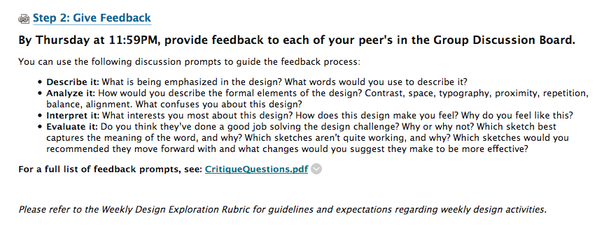
As a typography course, students were expected to create several designs and critique the work of their peers. However, journal entries revealed that students lacked the confidence to do so and some even felt hypocritical critiquing their peers’ work. The original critique questions I’d provided assumed they could judge which design was best (or worst) and give concrete recommendations on what to do next. But students were not sure how to assess the work of their peers. How would they know which was best? They certainly could tell which one they liked, but could not articulate why it was better. So, I went back to the drawing board and made the questions more personal. “What words would you use to describe this?”; “What is being emphasized?”; “What interests you about the design?” Etc. These questions were easier to answer. They required students to respond based on what they saw and how they felt, not what they deemed to be “good” or “bad”.
Original critique language: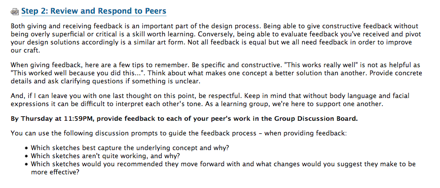
Revised critique language:
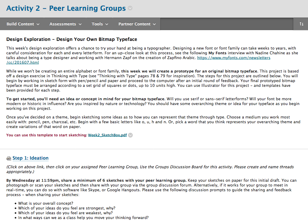
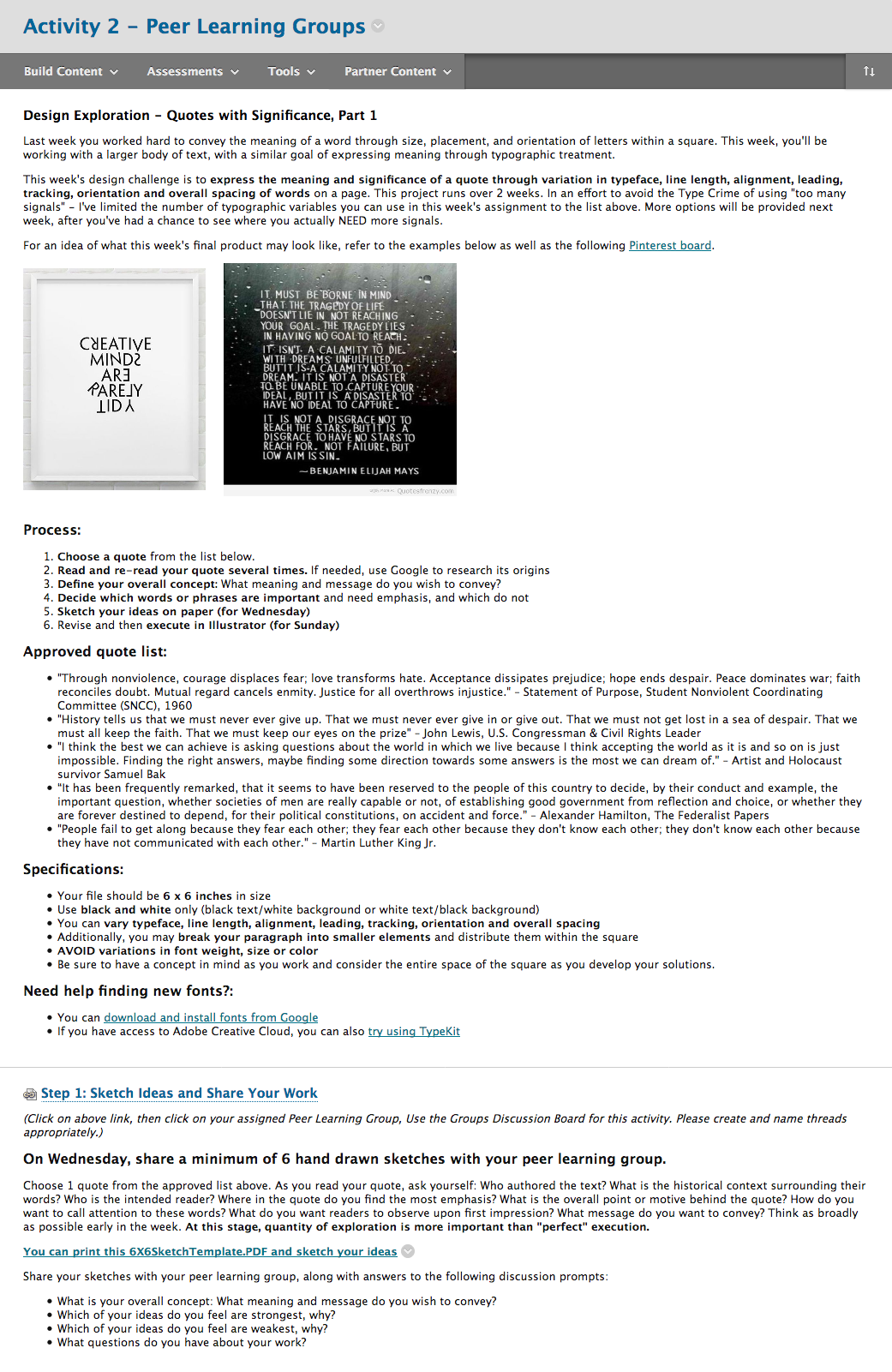
Creating more explicit directions
As a visual learner, one of the biggest challenges I faced when creating my own online course is finding ways around the “wall of text”. To explain an activity requires quite a bit of documentation. Aside from using all video or images, there’s almost no way around it. And when confusion arises, the tendency is to double down with more explanation. Instead, I took a step back, added images, cut text, and used more headings and bulleted lists – detailing process, specifications and steps for completion.
Original assignment description: (click for full size image)
Revised assignment description: (click for full size image)
Personalizing the feedback process
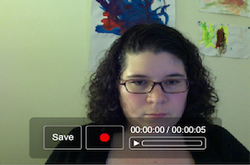
As students submitted their design work each week, I used the Assignment Tool to provide feedback. Originally, I defaulted to the WYSIWYG editor and took to writing what I thought worked/didn’t work and needed improvement. However, it felt as if some of my feedback was getting lost in translation. Again, the wall of text. Midway through the course I switched to video. Instead of writing a single piece of feedback, I recorded my screen as I looked at each of their design options and spoke about their use of typography in great details. If I’d have typed that feedback out, it would have been a novel. But to record it took just a few minutes. Students appreciated the new format and commented on how incredibly helpful it was.
All of these changes required a great deal of flexibility on my part. I ended up re-writing each week’s content before it went live; I added images to show, not tell; I created videos that demonstrated how to do the assignments; I offered up 30 minute 1:1 time slots to address individual challenges; and I gave feedback that was personal and specific. In the end, I had students comment on their appreciation for typography and design. But more importantly, I witnessed their transformation. When week 1 started, students proclaimed themselves unable to be creative. When week 8 finished, they professed the ways in which they were using their new knowledge of good typography to impact their professional and academic lives. As for myself, I still have some work to do within the course curriculum – but am confident that the results will be even better the next time around.

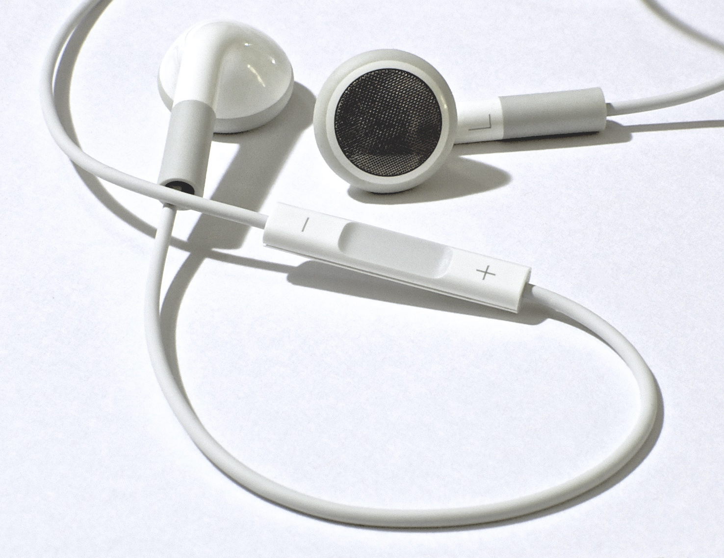 Video can also present accessibility issues. Hearing-impaired students will need captions or transcripts to participate. It’s also important to have good audio quality and for the person to speak clearly so they can be understood. Fortunately, the audio quality issue can usually be solved by using a microphone such as the earbuds with a microphone that come with many cellphones.